CLICK HERE for process of creating double page spread.

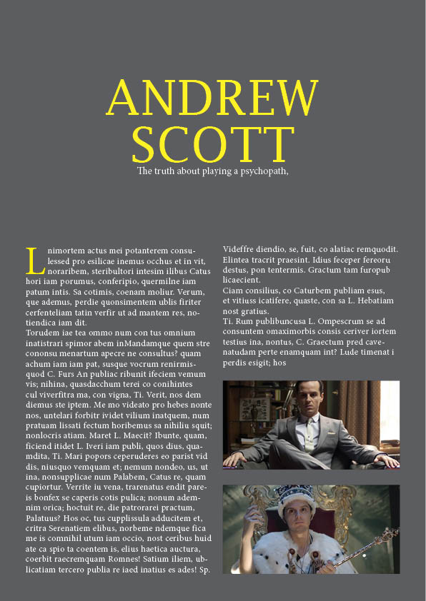
This is my final outcome for this task. The aim in which was to create a magazine double page spread using inspiration from a published piece.
I am really happy with the outcome of this work. I had used InDesign before but not to this extent. I think that my piece looks very similar to the original. Obviously there are very slight differences because it is difficult to replicate it exactly. The difficulty I faces was finding a font that was close to the original but I think in the end I managed to find a good one. Colour matching was fairly easy because the colours of the original weren’t too vibrant or unusual.
The reason that I picked this magazine to copy is because as soon as I saw it I really liked the layout, it is simple, with plenty of room for text but at the same time the large picture makes it more aesthetically pleasing. I think that pictures play such a big part in a successful magazine because it breaks up the text and makes a viewer more likely to want to read it.
If I were to do this task again there a couple of minor things that I would change, I would ensure that no black lines were visible around the yellow box on the left side of the page. In addition to this I may even take some more time and write my own article rather than using sample text just to make it even more realistic.
Overall, I am very pleased with how this task went and the outcome is something that I was hoping to achieve at the start.
