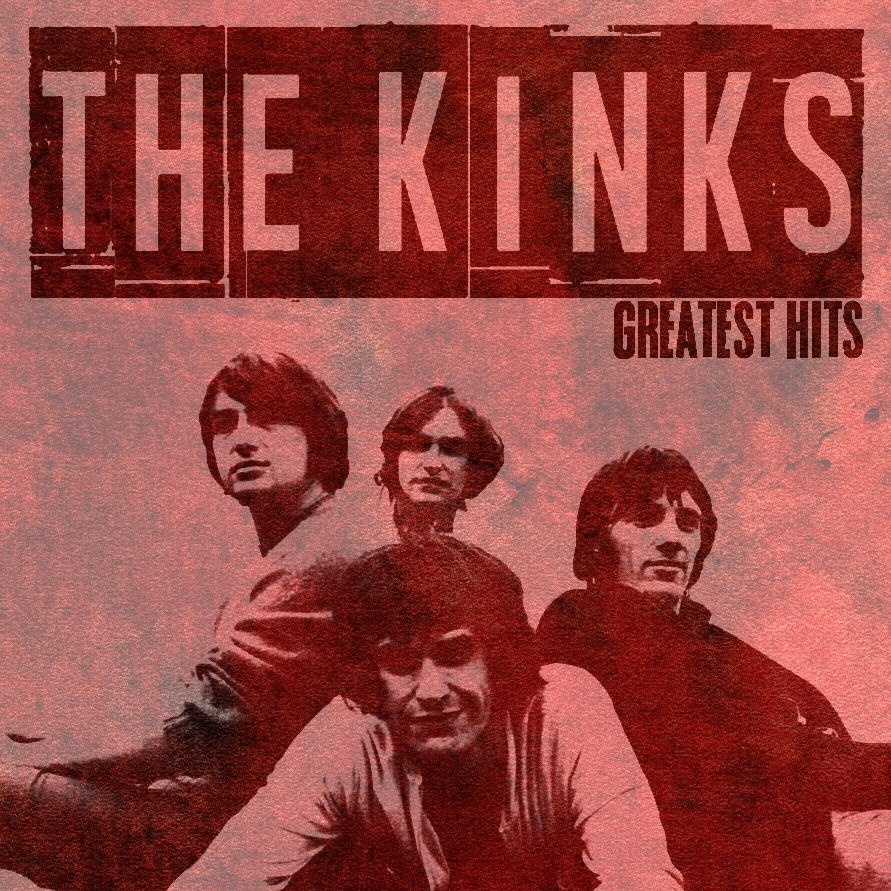
Using inspiration from various existing vinyl covers, I created my own design using Photoshop. It was important that I created a cover from an artist I liked to ensure I was able to understand what kind of vinyl cover they would have.
Using inspiration from various existing vinyl covers, I created my own design using Photoshop. It was important that I created a cover from an artist I liked to ensure I was able to understand what kind of vinyl cover they would have.
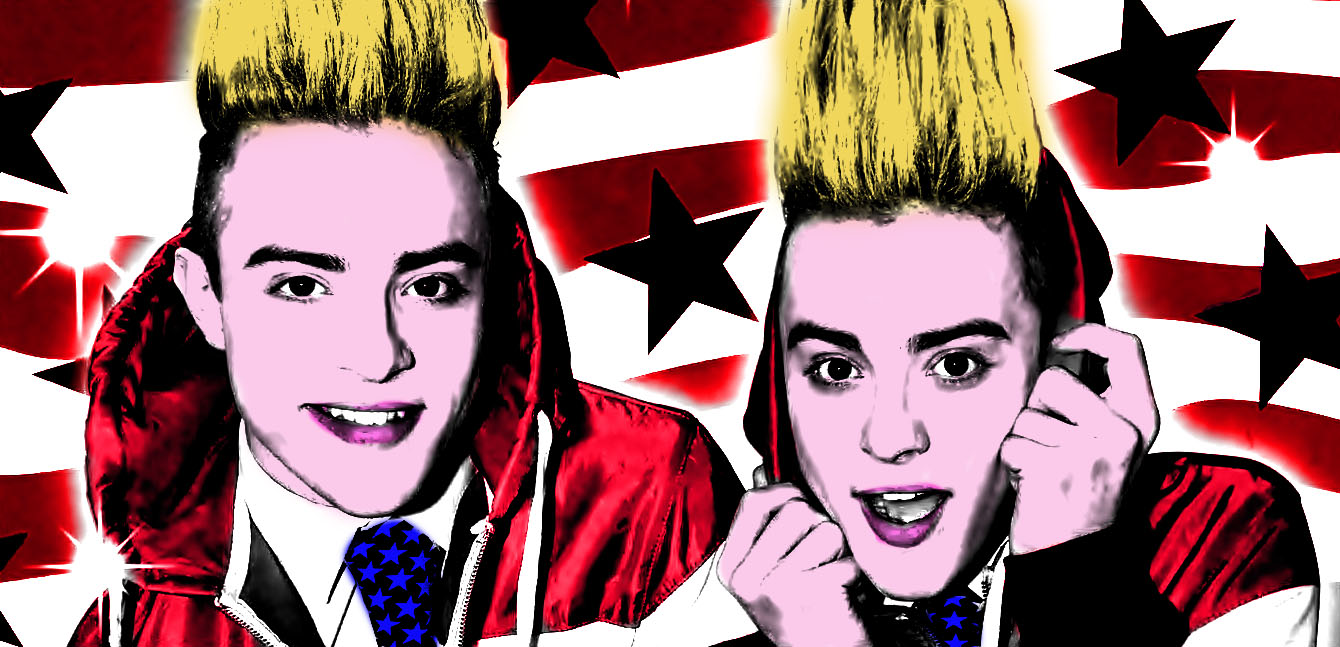
This is the outcome of my pop art work on Photoshop in the style of Andy Warhol. The process is as follows:
1. Open your image into Photoshop, changing it into black and white.
2. Up the contrast so the hair and clothes look dark enough
3. Duplicate the layer
4. Repeat step 2 for the facial features
5. Create a new layer for each of the different sections and use the paint tool to colour in the area.
6. Use the multiply function to blend it with the original layer.
7. Repeat steps 3-6 for each colour.
I was happy with the result of this, however if I were to improve this i would change the skin tone slightly. I chose to add a background rather than keep it plain because I believe it adds to the final outcome.
CLICK HERE for process of creating magazine cover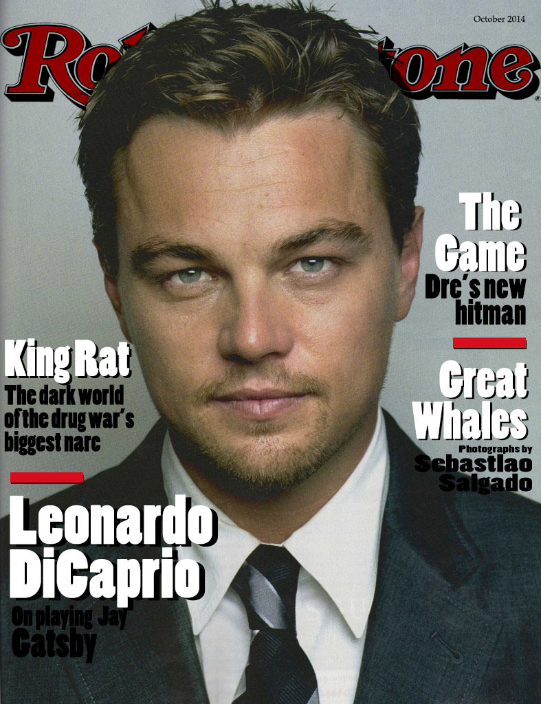
Using Photoshop I created a magazine cover inspired by a previous magazine cover. It was important for me to create it from scratch and use the tools on the programme to replicate it as best as I could.
I was happy with the heading and the image quality, the colouring being faded which is often seen on Rolling Stone magazine, and the white text has a nice finish to it.
However I did struggle with the black text because it feels too dark on the jacket area, perhaps I could have used the dodge tool to lighten the jacket ever so slightly.
Overall, I think this has worked well but there are a number of improvements I would make if I were to do it again.
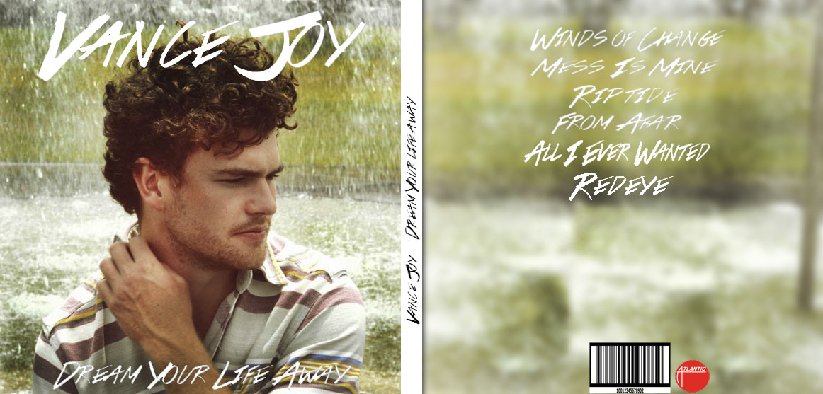
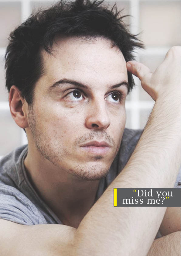
This was a task which I took on just to practice my Photoshop skills, I was very pleased with this because my idea was to redesign Vance Joy’s album which is a black covered quite dark piece of imagery. Obviously the main issue with this is the layout, if I were to print it out, then it would be back to front but the design aspect is still successful.
I fell it is important to create simple things like this on Photoshop just to improve skills and refresh what I have previously learnt.
CLICK HERE for process of creating film poster
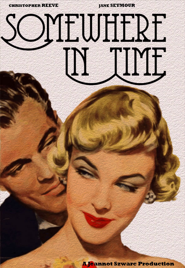
This was the outcome of my vintage film poster created using Photoshop. I was pleased with the outcome because it has the artistic feel to it, and the simplicity seen in a lot of old fashioned film posters.
The oil painting effect improved the visual effect from its original state.
CLICK HERE for process of creating double page spread.
This is my final outcome for this task. The aim in which was to create a magazine double page spread using inspiration from a published piece.
I am really happy with the outcome of this work. I had used InDesign before but not to this extent. I think that my piece looks very similar to the original. Obviously there are very slight differences because it is difficult to replicate it exactly. The difficulty I faces was finding a font that was close to the original but I think in the end I managed to find a good one. Colour matching was fairly easy because the colours of the original weren’t too vibrant or unusual.
The reason that I picked this magazine to copy is because as soon as I saw it I really liked the layout, it is simple, with plenty of room for text but at the same time the large picture makes it more aesthetically pleasing. I think that pictures play such a big part in a successful magazine because it breaks up the text and makes a viewer more likely to want to read it.
If I were to do this task again there a couple of minor things that I would change, I would ensure that no black lines were visible around the yellow box on the left side of the page. In addition to this I may even take some more time and write my own article rather than using sample text just to make it even more realistic.
Overall, I am very pleased with how this task went and the outcome is something that I was hoping to achieve at the start.
